Valentine’s Day Email Marketing Roundup

With all the publicity that surrounds it, you’ll no doubt be aware that today is Valentine’s Day, the day when we flock to the shops to invest in cards and presents for that special someone! (p.s. it’s even possible to pick up some special Valentine’s Day email offers!)

For retailers too, it’s a big day, with millions of pounds of sales expected. That means for email marketers, the stakes are high.
You might have seen our tips last week looking at how to send the perfect Valentine’s email, but how many retailers hit the nail on the head?
Love is in the air… but is it in email?
Like everyone, we’ve received our fair share of Valentine’s emails, so we thought we’d pick out the best ones and highlight areas we thought worked and places where the retailers missed a trick.
M&S
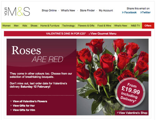
We liked – the header at the top reflects the navigation bar of the website, making it easy for recipients to quickly click through to certain areas of the site if they need to.
The red banner at the top acts as a teaser for content that appears further down the message. It’s also great to see the use of a specially created microsite, with their ‘Valentine’s Day Shop’.

We didn’t like – the rest of the email actually shifts away from the Valentine’s Day theme. While this might not be the worst idea as it catches people who aren’t interested in Valentine’s day offers, surely it would have been better to segment the non-openers of this email and send them a non-Valentine’s Day focused email as a follow-up?
River Island
We liked – this email has as a good range of social media sharing options, which perfectly suits what is likely to be a younger audience group.
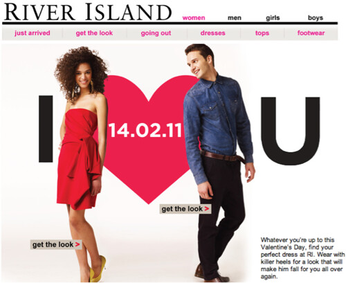
We didn’t like – the absence of personalisation. This email is clearly geared towards a female reader (though they have at least included a link to male outfits), but the person who signed up to this email was actually male.

This suggests that either they didn’t make any effort to collect this data during sign-up or that it has been ignored. At this time of year, in particular, it is important to send very relevant, targeted messages.
Comet

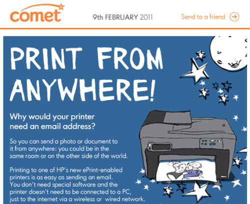
We liked – there is a really good use of personalisation in the subject line, which catches the reader’s attention and reels them in. This is especially important at a time when the inbox is likely to be filled with seasonal messages.
We didn’t like – to be fair to Comet, it’s not the brand that immediately comes to mind when you think of Valentine’s Day. And it is possibly for this reason that the email feels slightly half-hearted. Despite mentioning the day in the subject line, the rest of the email hardly mentions it and doesn’t include any of the branding you’d expect. Are printers really the best choice of Valentine’s product?
Fortnum & Mason
We liked – again, a good use of a Valentine’s Day microsite. Flagging the free delivery offer at the top of the email is good too. The design of the message perfectly fits in with Fortnum’s brand guidelines.
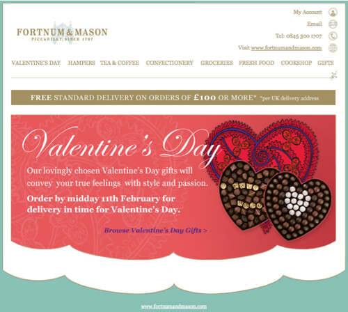
We didn’t like – This is quite a short email and while you could argue this gives it more of an impact, by including some alternative offers or products further down, the company could have given itself more chance of getting that all important click through.
Tesco Food & Wine
We liked – There is a good balance of text and images in this email. Even with images turned off, it is clear from the copy at the top left of the email what the message is all about.
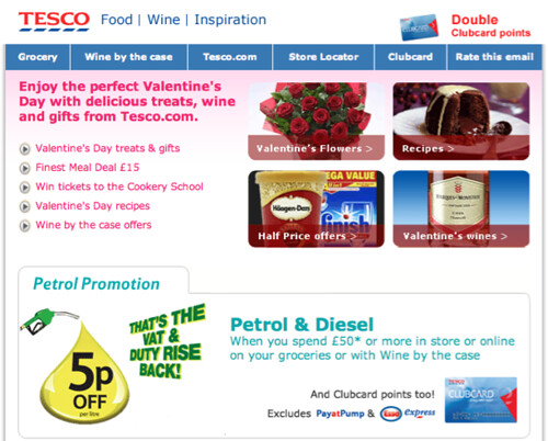
We didn’t like – A mix of Valentine’s Day deals and general offers makes the newsletter feel a bit complicated and could confuse.
And the winner is…
So who captured our hearts when it came to their Valentine’s Day emails?
Because of the use of specific design and microsite, we’ve decided to go for Fortnum & Mason! Despite the short message, it was clearly put together and left us wanting to know more. Plus, it was easy on the eye (wink wink!)
So congratulations Fortnum & Mason! And have a great Valentine’s Day!
