3 unforgettable email design tips


Good email design can be the difference between a conversion and an automatic trip to the trash. For holiday email marketing it’s even more important. The weeks between Thanksgiving and New Year are noisy and chaotic for brands and consumers alike.
Email subscribers decide to read or delete an email within five seconds of opening. During the holiday season, shoppers face a massive influx of marketing emails into their inbox. The time the dedicate to reading emails is reduced. If you’re not making a visual impact, you have to rely on consumer’s awareness of your brand to drive conversions.
As shoppers search around for the right price and product to gift to their loved ones, their brand awareness might not be enough to convert.
Why is good email design important?
This year, as a result of the ongoing global pandemic, online sales have already spiked. As people can’t visit loved ones and Christmas celebrations are canceled, there’s going to be greater pressure on online stores this year. Adding a little holiday sparkle to your email marketing will help your efforts stand out.
1. Readers decide whether to delete your email within in five seconds
A well-designed email has the power to capture attention. Once you’ve hooked a reader with your visuals, half the battle is over.
2. 49% of all emails opens are on mobile devices
Testing and ensuring every email is mobile-responsive assures that every email sent has the impact you want.
3. Email marketing generates $42 for every $1 invested
Converting should be quick and easy to encourage readers to shop. Good email design shouldn’t overwhelm the reader with products and buttons to press.
3 unforgettable email design tips
They’re unforgettable because they’re simple. So simple, in fact, that you can implement them as soon as you finish reading this post.
1. Add GIFs and APNGs to your emails
Level-up your email marketing by adding engaging animations to your emails. GIFs and APNGs capture the reader’s attention and add an element of delight to your campaign.

Just a little bit of movement is enough to surprise the reader, trigger interest, and encourage them to click on your email marketing campaign. Emails with animated GIFs can see their click-rates lifted by over 20%. Instead of relying on lengthy copy or multiple images, one GIF or APNG will do the trick.
Give your emails a holiday feel by adding seasonal gifs to your marketing campaigns. Not only will this help you stand out from the crowd, but it will also create a lasting experience for the reader.

2. Keep it plain and simple
Emails need to be easy to consume anywhere and, on any device. Cluttered and wordy emails are going to instantly bore or irritate readers. On mobile devices, where space is limited and attention spans are shorter, simpler content will always win.
You need a well-balanced, simple email design that drives the readers into action. Make sure your calls to action are clear and easy to follow.
When it comes to your holiday marketing, you need to have a clear purpose for every email campaign. By defining your purpose before you build your email, you can ensure your message is clear and conversion is easy.

3. Focus on the customer experience
As well as knowing what you want to achieve with your email campaign, consider what the reader wants from you.
It’s the holiday season, so they’re probably on the hunt for the perfect gift for their friends or family. How can you make this process not only easier for them, but convince them that you’re the brand they should choose?
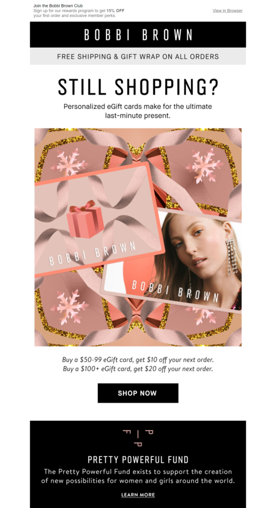
During the holidays, you can’t beat a gift guide. Keep customers calm and point them in the right direction so they can stop panicking about Christmas shopping. To ensure your readers convert think about the journey you want them to take in your email.
Amanda Wakeley showcases some of their top stocking fillers in this engaging gift guide.
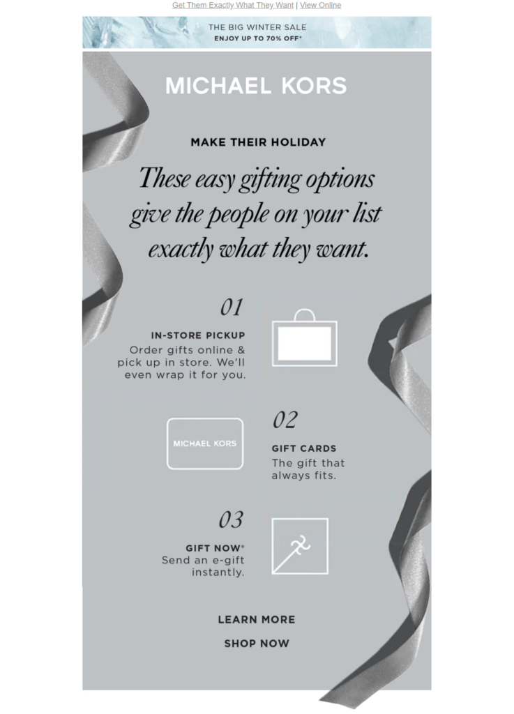
Gift guides need to encourage the reader to scroll and your design can help. Guide subscriber’s eye down the page to your main CTA using color-blocking, zig-zag, or an inverted triangle technique. Doing this, you’ll encourage them to click through, explore your website, driving more traffic, and more sales for the holiday season.

Michael Kors use a zig-zag design to drive readers to learn more about their gift card options.
Really good email design
Designing a really good email doesn’t need to be difficult. These simple tips are not just for the holiday season. Apply them to your day-to-day newsletters and marketing campaigns and watch your engagements soar.
Get more inspiration for awesome email design by checking out our top marketing resources.


