The story behind the dotdigital rebrand


Our vision
We embarked on our mission to rebrand when we realized the dotmailer name no longer encompassed everything we do. We started by looking at the limitations and shortcomings of the current branding and found a consistent problem: our name inhibited our customers from discovering our diverse range of features and channels.
This was our challenge. We needed a new brand that was streamlined and futureproof.
We wanted to make it easier for people to know exactly what we do while carrying over the recognition that our brand had built across the MarTech industry. Finally, we wanted to create something that was in keeping with our culture but also reflected our vision for the future.
We wanted our new logo to show the amazing and powerful ways our customers are using the platform.
– Phil Draper, General Manager at Dotdigital


Sitting down with teams across the business, we brainstormed ways the new brand could evolve to reflect the advanced tactics customers were employing using our platform. Time and again, we saw our customers were being driven by the need to genuinely connect and engage with their audiences. In the constantly shifting world of marketing, long-lasting relationships are the key to success.

Platform evolution: time our name caught up
In our efforts to pre-empt customers’ needs, we expanded far beyond the capabilities of a simple email provider. From our beginnings in 2002, we’ve added channels, features, and integrations to our platform, year on year, until becoming a customer engagement platform with powerful cross-channel capabilities.
16 years of continuous development has led to our platform containing all the tools you need for faster, smarter marketing. Dotdigital connects systems and data, empowering you to create long-lasting relationships with customers.
Dotdigital – Product history from Dotdigital on Vimeo.

Phil Draper, CMO at Dotdigital, led the charge to execute our vision:
“The dotmailer logo, the target, represented a single outcome – one email sent to the one customer. That’s no longer what our customers are doing. They’re automating, segmenting, and personalizing across email, mobile, ads, and SMS. They’re connecting with their ecommerce platforms, CRM, and offline systems in physical stores. With this rich data, they’re engaging with customers in a deeper and more meaningful way.
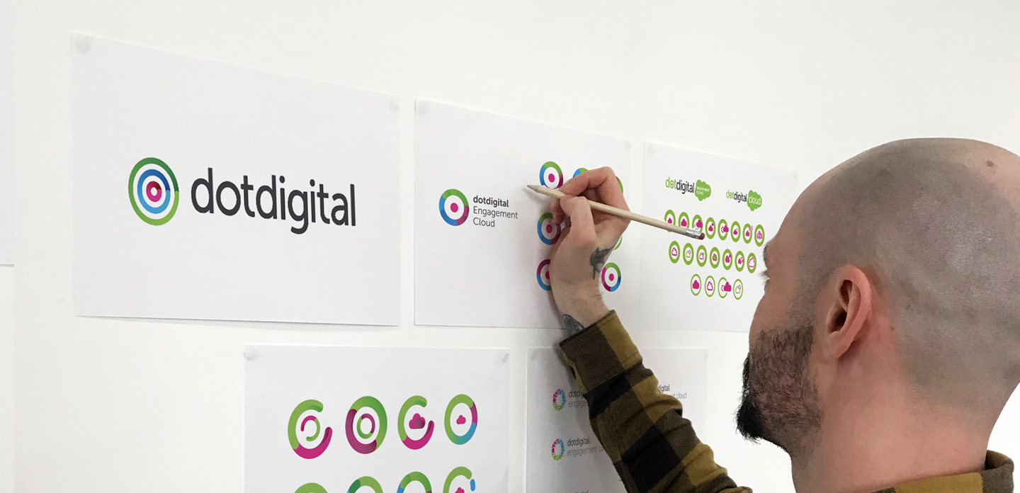
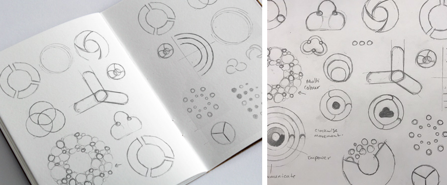
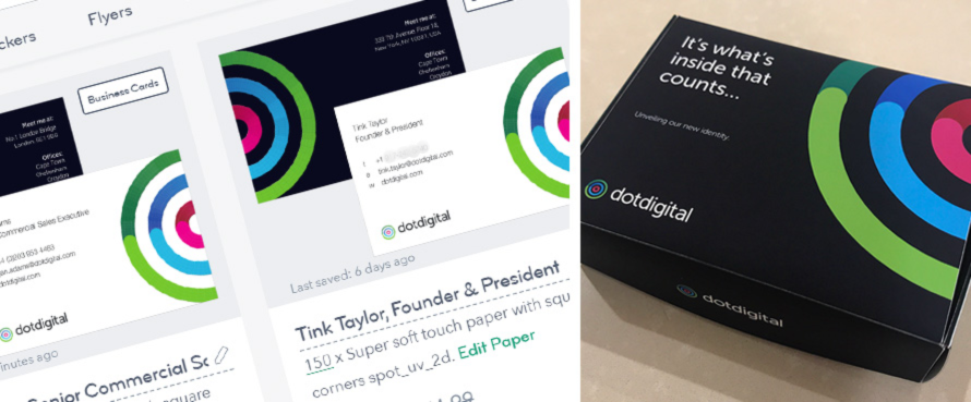
“Maintaining the circular motif of Dotdigital, as well as the pink and green synonymous with the brand, we added the bold blue of Comapi to create something recognizable, but new. Our three roundels represent our three solution areas: connect, empower, and communicate.
“To reflect the dynamism of our customers, we introduced graduated colors to represent the speed and agility of our platform as we continue to evolve. But, the multi-faceted logo also represents the movement of each solution area, working in conjunction with the others; the speed with which brands can grow with us; and, the never-ending possibilities that Dotdigital presents.
“By including this element of movement, we’re also demonstrating our commitment to innovation. Never content with resting on our laurels, we’re always striving towards our next platform evolution.”

New brand. Brighter future


As Dotdigital, we continue to recognize our rich history of individuality. Removing the emphasis on ‘mail’ in our name, we’re set for a brighter and exciting future.
The dotmailer platform has been reborn as Dotdigital. As we grew, so did you. You’re no longer using our platform to simply measure your outputs. Instead, you’re focusing on your outcomes. It’s no longer about the number of new subscriptions and emails sent, but rather about the quality of every engagement.
And we’ve got everything you need to make it happen.


